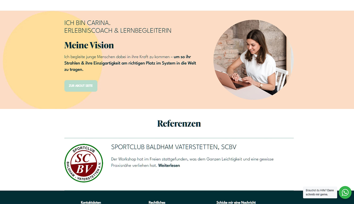
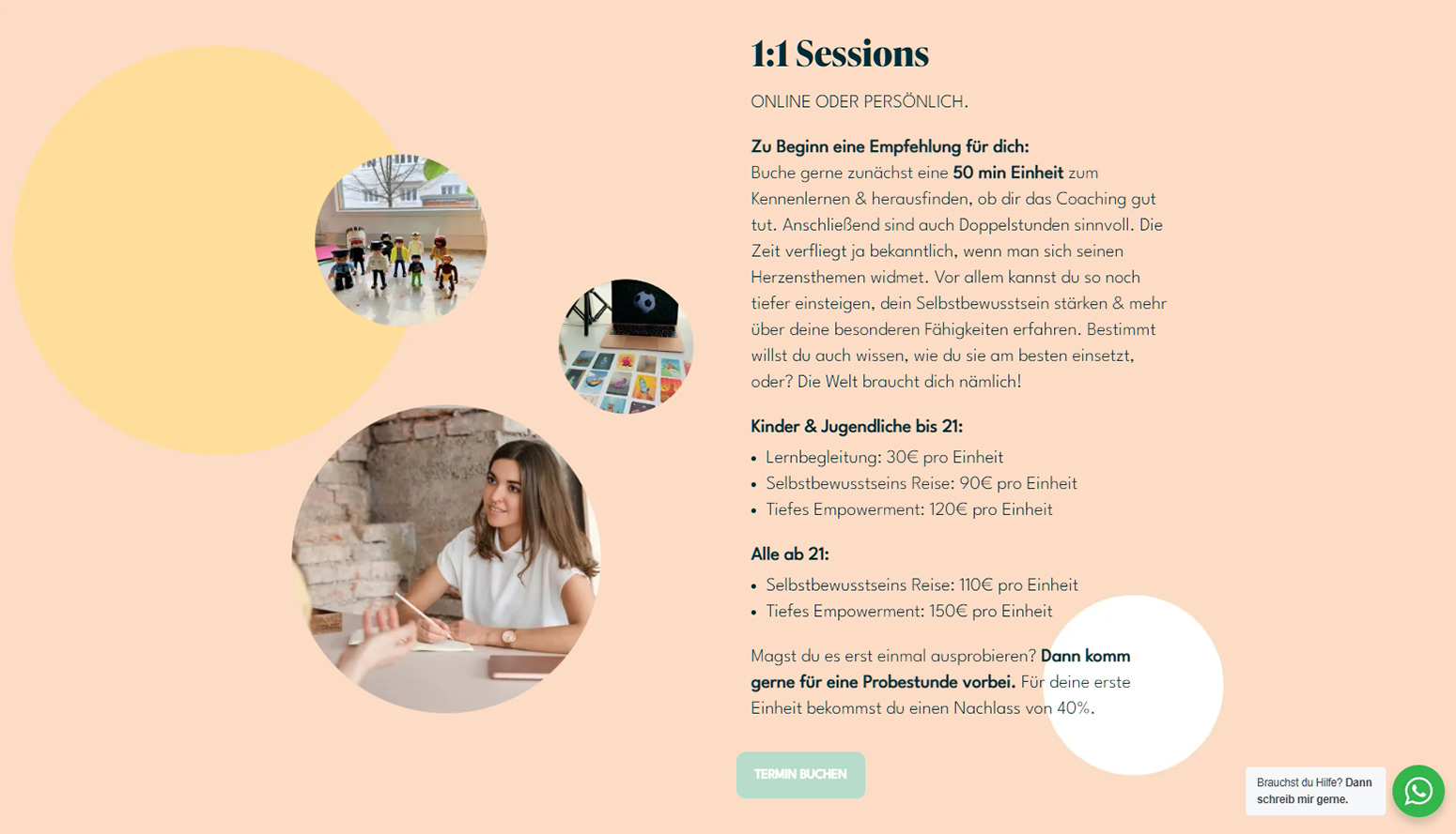
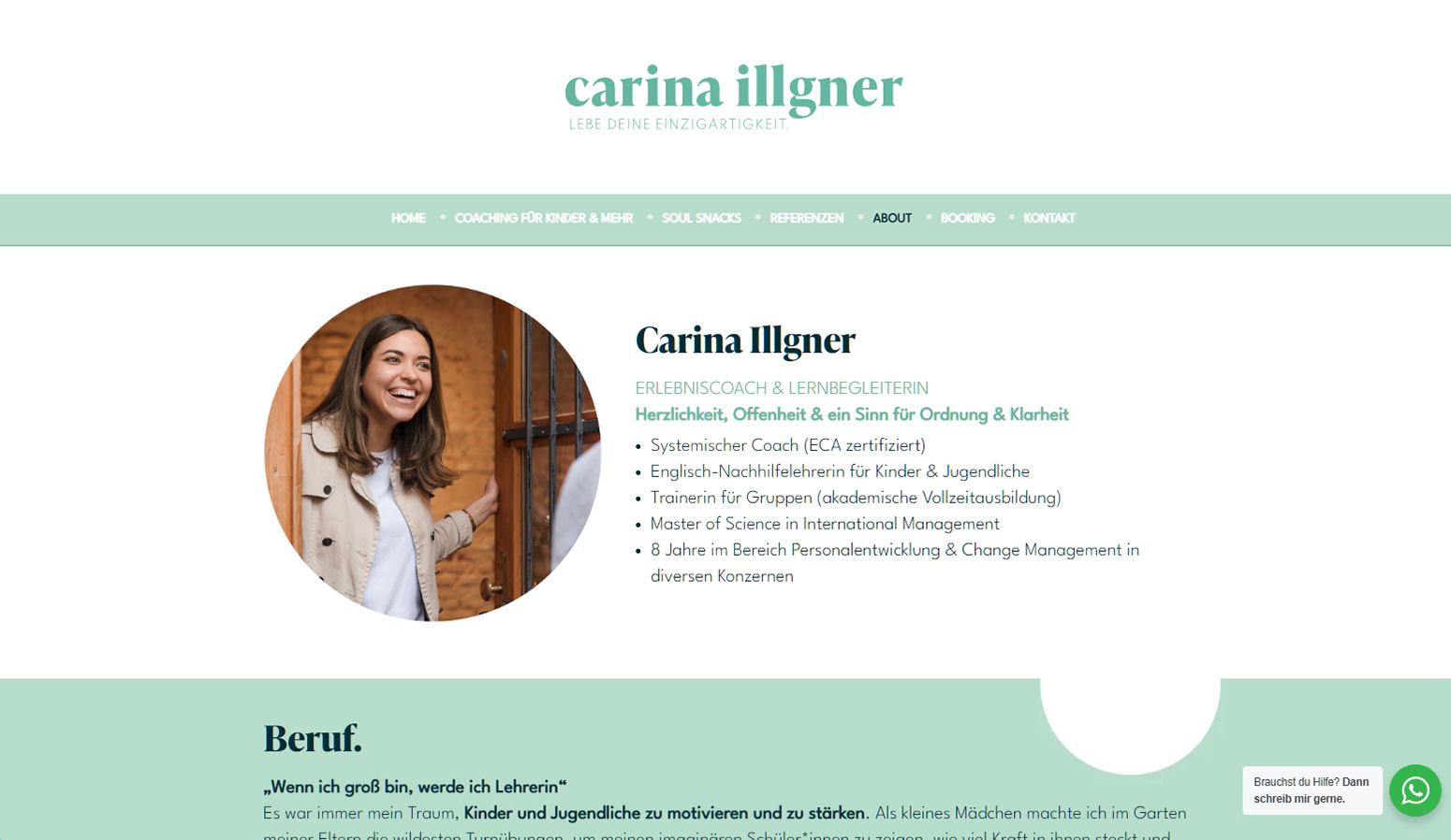
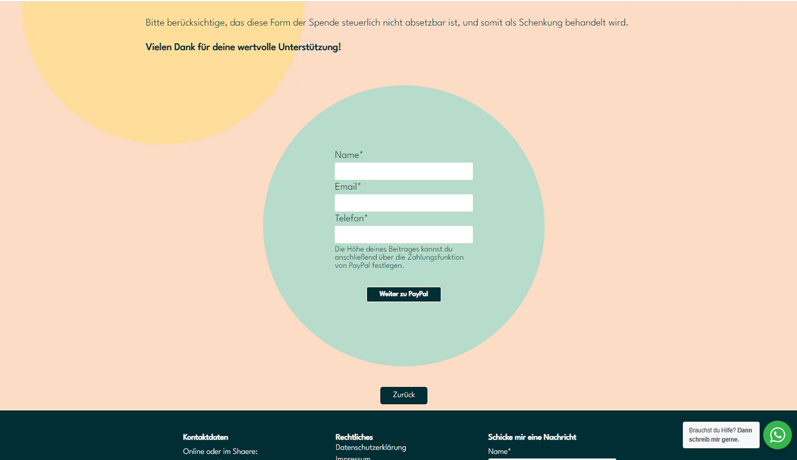
Carina’s visual identity is based on circles and a fantastic colour palette. For the website refresh, I leaned into this circle theme and put traditionally ‘square’ elements like the contact forms into circles, and the brought in the rich identity colours for the website’s page backgrounds.
Visit the site at carinaillgner.com


